Why your concrete plant drawings are likely lying to you about capacity

The D Model That Cost Us $k in a Single Week
I remember staring at the CAD screen on that rainy Tuesday in late October. The layout looked perfect. Every bin aligned, every conveyor straight. Textbook engineering.
Then we started production. The mix buggies sat idle for minutes a day. Why? Because the dwg file ignored one tiny thing: the angle of repose during high-speed loading.
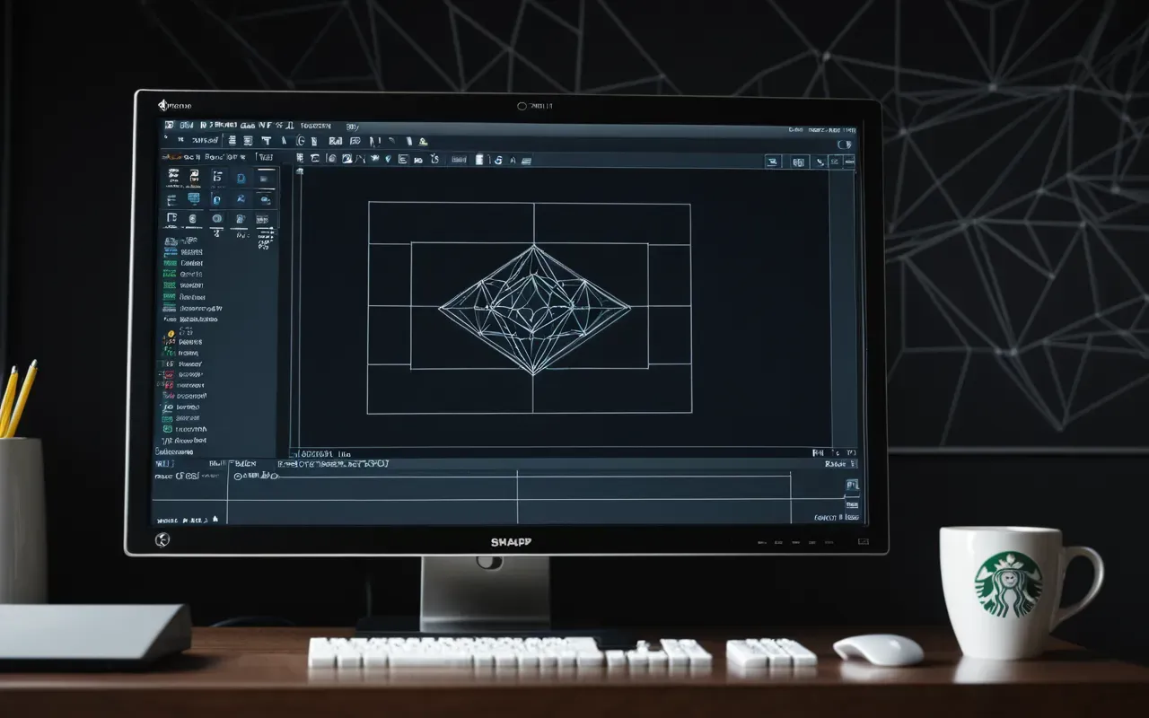
This is the quiet failure mode that plagues most operators. The drawings are static pictures of dynamic processes. They show you where things sit, not how they move.
What a DWG Actually Tells You (And What It Hides)
A standard drawing file is essentially a frozen moment in time. It captures dimensions, coordinates, and part numbers with surgical precision.
The Static vs Dynamic Reality Gap
Here’s the thing. Concrete flows. It shifts, settles, and sometimes clumps. A static line on a screen doesn’t account for the vibration of a -tonne hopper filling at full tilt.
I’ve seen plans where the mixer door is placed exactly two meters from the discharge point. Perfect in theory? Absolutely. In practice, that distance creates a traffic jam during peak hours.

The file gives you the skeleton. It doesn’t give you the blood flow. If your engine runs on those lines alone, you’re driving a car without looking at the road.
Why % of Operators Trust the Lines Too Much
It’s human nature. We trust precision lines over messy reality. The dwg looks professional. It has layers, blocks, and annotations that scream authority.
But I’ve noticed a pattern in the industry forums. People post their layouts looking for validation on spacing. They rarely ask about flow dynamics or material behavior under stress.
To be fair, most suppliers provide these files as installation guides, not operational blueprints. That distinction is lost in translation between engineer and operator.
The Hidden Bottleneck Hiding in Your Layout Lines
Let’s talk about the screw conveyor. On paper, it looks like a simple tube. In reality, it’s a pressure vessel for abrasive particles.
The Angle of Repose Problem in Dry Mixes
Dry mortar behaves differently than wet concrete. It doesn’t slump; it stands up. This creates a cone shape inside the bin that changes how material exits.

If your dwg shows the outlet directly below the center of that cone, you’re fighting physics. You need eccentric outlets or agitators to break up that bridge.
How Line Spacing Misleads Maintenance Teams
I once visited a plant where the service walkway was marked as centimeters wide. The manual said that was sufficient.
Then I watched a technician try to change a gearbox oil seal in that space. He couldn’t even fit his wrench handle properly. The line didn’t account for tool clearance.
That’s a classic dwg trap. It measures the gap, not the work envelope. You need to add human factors into your mental model of those lines on screen.
Why Most Suppliers Hand You Generic CAD Files
This isn’t malice. It’s economics. Customizing a detailed operational model for every client costs money that most buyers don’t want to pay upfront.
The One-Size-Fits-All Template Issue
Manufacturers build standard templates. They tweak the bin sizes, maybe change a conveyor length. But the core logic remains static and generic.

If you’re comparing options, check how the hidden flaw in every modern concrete plant manifests in their documentation. It often starts with oversimplified visuals.
What You Should Actually Be Asking for
Stop asking just for the dwg. Ask for flow simulation data or at least a detailed process map that shows material velocity and pressure points.
A good supplier will have this ready if they care about uptime. If not, you’re buying the skeleton without knowing how it moves.
How to Audit Your Own Plant Lines for Red Flags
You don’t need a PhD in fluid dynamics. You just need eyes that question the obvious lines on your screen.
Check Point : The Mixer Discharge Path
Look at the line from mixer to truck. Is it straight? Straight is good for speed, but bad if there’s no buffer zone.

If the line ends exactly at the truck edge, you’re relying on perfect timing. One slow driver and your whole line backs up.
Check Point : Bin Outlet Geometry
Open your file and zoom into the bin outlets. Are they centered? Centered is a recipe for bridging in dry powders.
Offset outlets or angled chutes break up that bridge naturally. If you see perfect symmetry, start looking at your downtime logs.
Check Point : Conveyor Transfer Points
Every transfer point is a potential bottleneck. The dwg shows the connection, but not the wear pattern that develops over months.
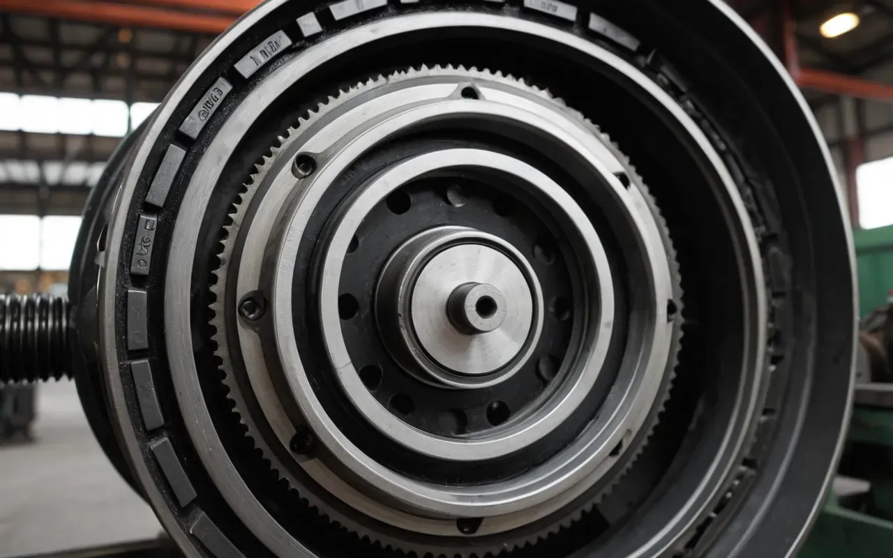
If the lines show tight corners or abrupt changes in direction, expect dust accumulation. That clogs sensors and slows throughput.
The Real Cost of Ignoring Flow Dynamics
We talked about the $k loss earlier. That was just one week. Multiply that by a year and you’re looking at six figures gone.
Why Downtime is More Expensive Than You Think
It’s not just lost production. It’s the overtime pay to catch up, the rushed quality checks, and the customer complaints that follow.
I’ve seen companies spend months tweaking software settings because they couldn’t accept that their physical layout was flawed.

The software can only control what the hardware allows. If the lines restrict flow, no code in the world will fix it.
The Opportunity Cost of Static Thinking
While you’re fighting a static layout, your competitors are using dynamic flow analysis. They see the invisible forces.
They adjust their chutes, add vibrators at key points, and keep material moving smoothly even during peak demand spikes.
What to Do Next With Your Current Drawings
Don’t panic. You don’t need to tear down your plant tomorrow. But you do need to start asking better questions.
Step : Map Your Actual Downtime Spots
Take your dwg and overlay it with a map of where you actually stop production. Mark those spots in red.
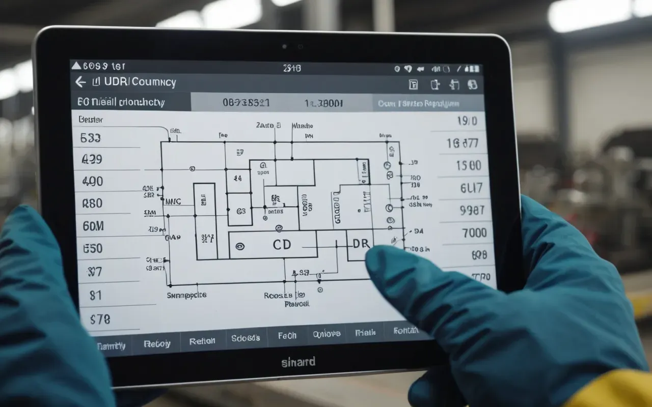
If the red spots align with tight corners or centered outlets, you’ve found your problem. The lines were telling the truth all along.
Step : Request Process Simulation Data
Go back to your supplier or a third-party engineer. Ask for flow simulations, not just static images.
If they can’t provide it, consider that a major red flag in their engineering capabilities and support structure.
Step : Pilot Small Hardware Tweaks
Try adding a small vibrator at one suspected bottleneck. Measure the output change over a week.

If output jumps by even %, you know the static lines were hiding a dynamic flaw. Scale that fix to other points.
Step : Update Your Documentation Protocol
Stop treating the dwg as a finished product. Make it part of an ongoing operational review cycle.
Include real-world performance data in your file notes. Let future operators see what actually happens, not just what was planned.
Frequently Asked Questions
What is the main limitation of a standard concrete batching plant dwg?
Standard drawing files show static positions but do not account for dynamic material flow, vibration, or wear patterns. This often leads to unexpected bottlenecks and downtime during production.
How can I identify hidden bottlenecks in my plant layout?
Overlay your actual downtime log onto the drawing file. Red spots at tight corners or centered outlets usually indicate flow restrictions that static lines fail to predict.
Why do suppliers provide generic CAD templates instead of custom models?
Custom operational modeling is expensive and time-consuming. Most manufacturers use standard layouts to reduce production costs, leaving dynamic flow issues to the operator.
Does a perfect alignment in drawings guarantee smooth operation?
No. Perfect visual alignment often ignores material behavior like bridging or segregation. Dynamic forces require physical adjustments that static lines cannot capture.
Comments ()